

INTRODUCTION
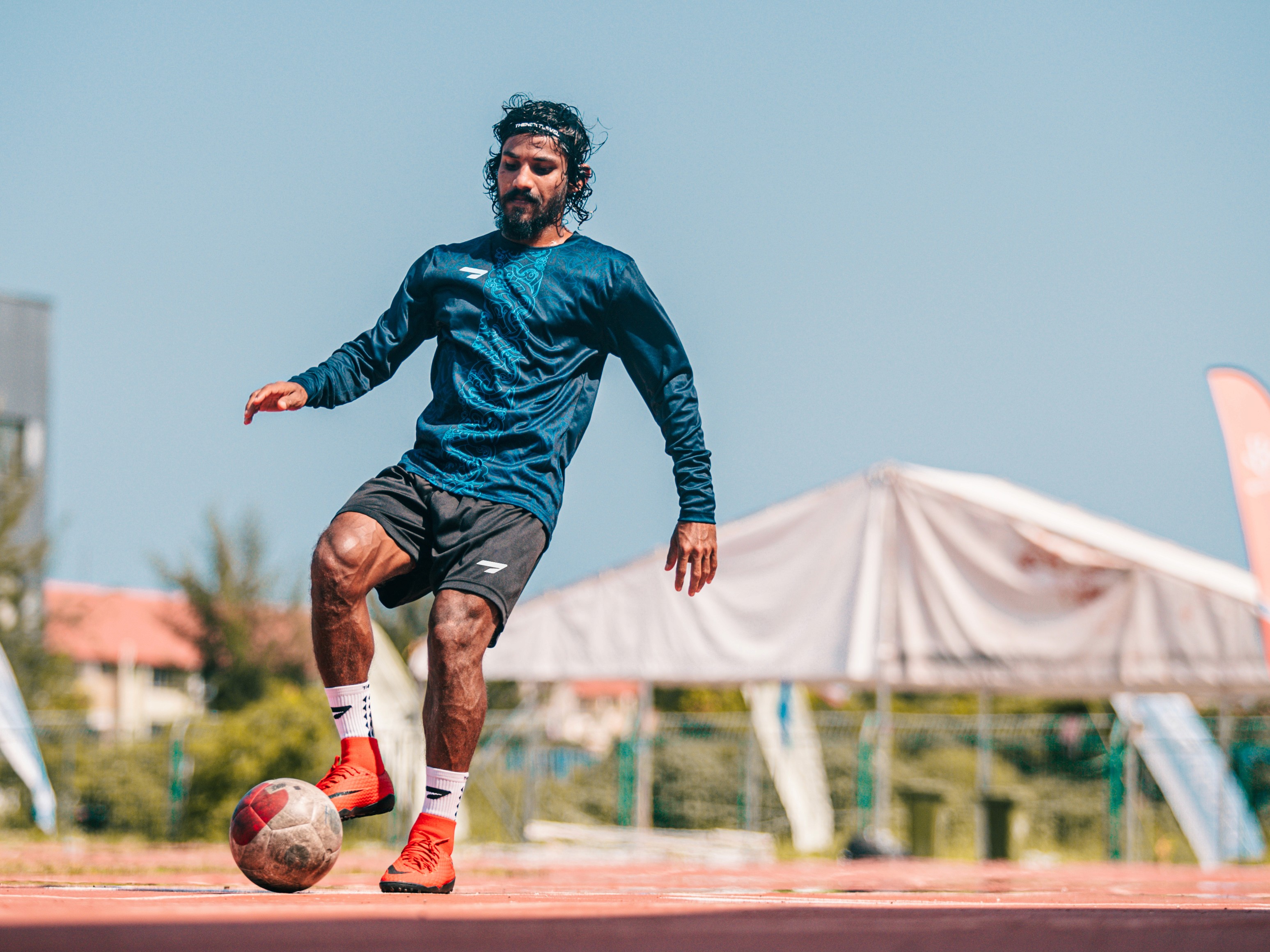
Jerzia is a distinguished Online Sports Apparel store based in the Maldives offering a wide variety of high quality sports apparel, accessories, and so much more.
COLOR
For Jerzia's color palette, we went with a split complementary palette. The main focus is to use Lime Green tints and shades, creating a sense of freshness and motivation. The other colors fall somewhere between phantom black and clean white, adding a touch of versatility to the mix.


TYPOGRAPHY
For the brand typography, we have chosen Clash Display and Montserrat. It's a great duo that looks good in every possible use case, whether it's online or offline. It adds a touch of informality and works well for headings, short copy, and mid-sized text.

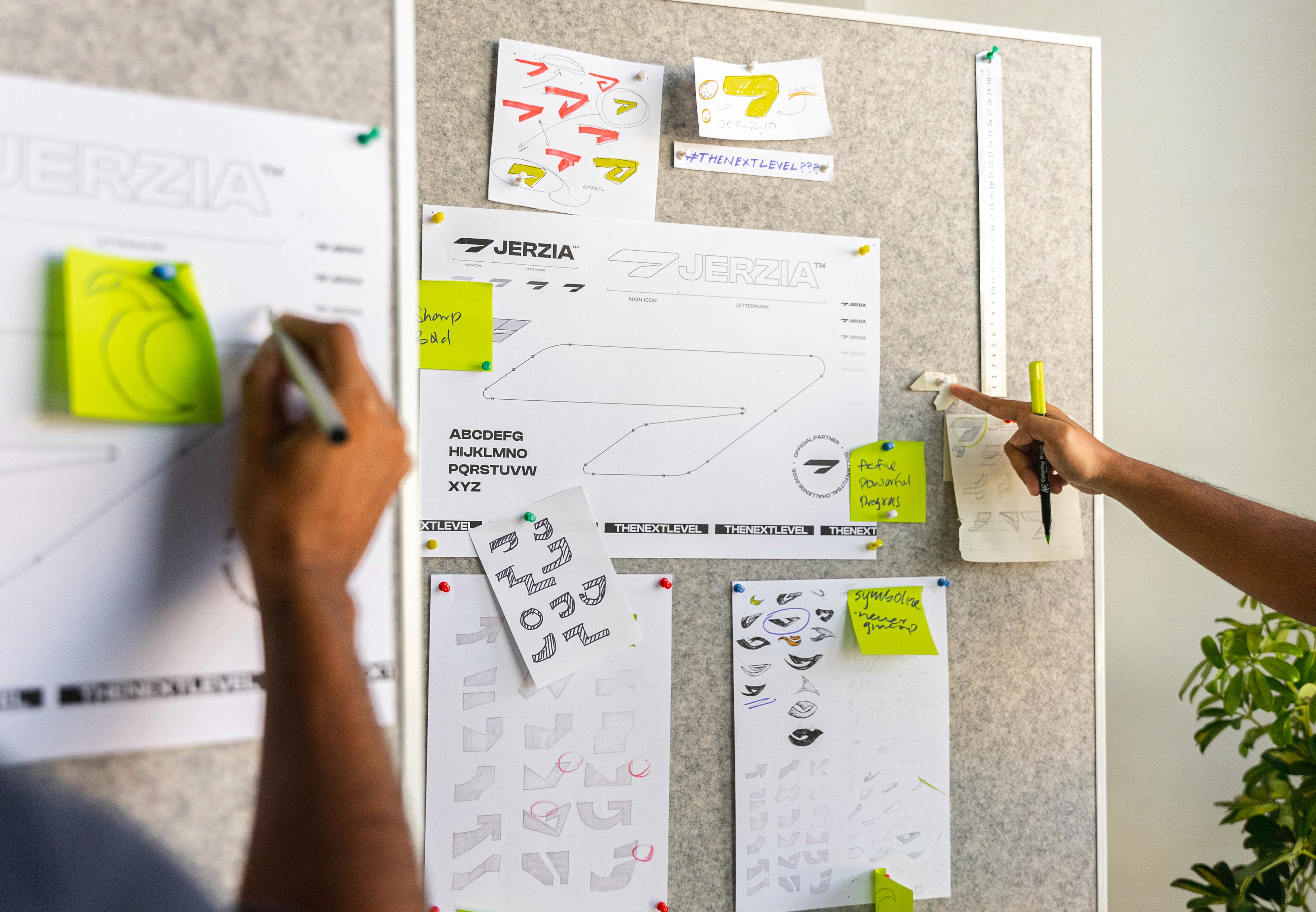
CO-BRANDING
When it comes to delivering a branding, we take the little things very seriously. And since Jerzia often partners with sports clubs and tournaments, we made sure to provide them with guidelines and visual options on how to use their brand. We wanted them to feel confident and empowered when representing their brand in various contexts.