Chao is one of three virtual brands we helped bring to life for Mū Kitchen, a multi-cuisine, experimental concept for people who want fast, familiar food, without giving up on quality or taste. We handled the naming, identity, and strategy behind it, shaping a brand that looks as craveable as the food it serves.
Naim

Layana

Najih


The colour story leans on one hero hue, a bold hot pink, paired with a deep burgundy through punchy colour blocking. The logo carries the same spirit, a simple waving hand that nods to the tagline, "Say goodbye to hunger," giving Chao a personality that's playful, colourful, and still gourmet.


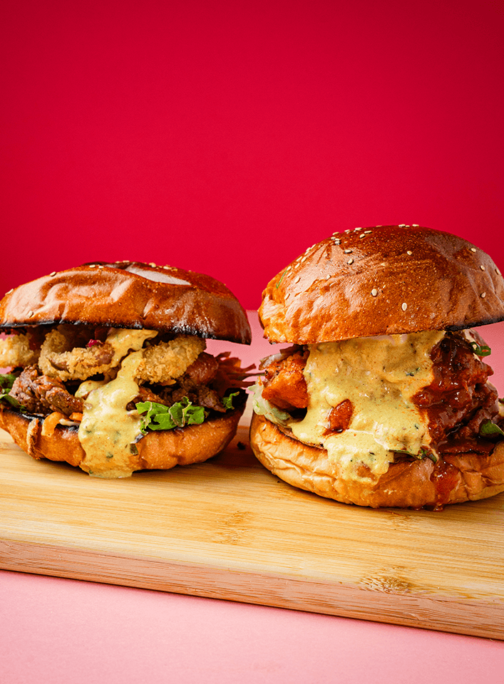
Behind the camera, we leaned into quirky, candid shots over posed studio setups, fast-paced and a little raw, built for a Gen Z audience that eats with their eyes first.